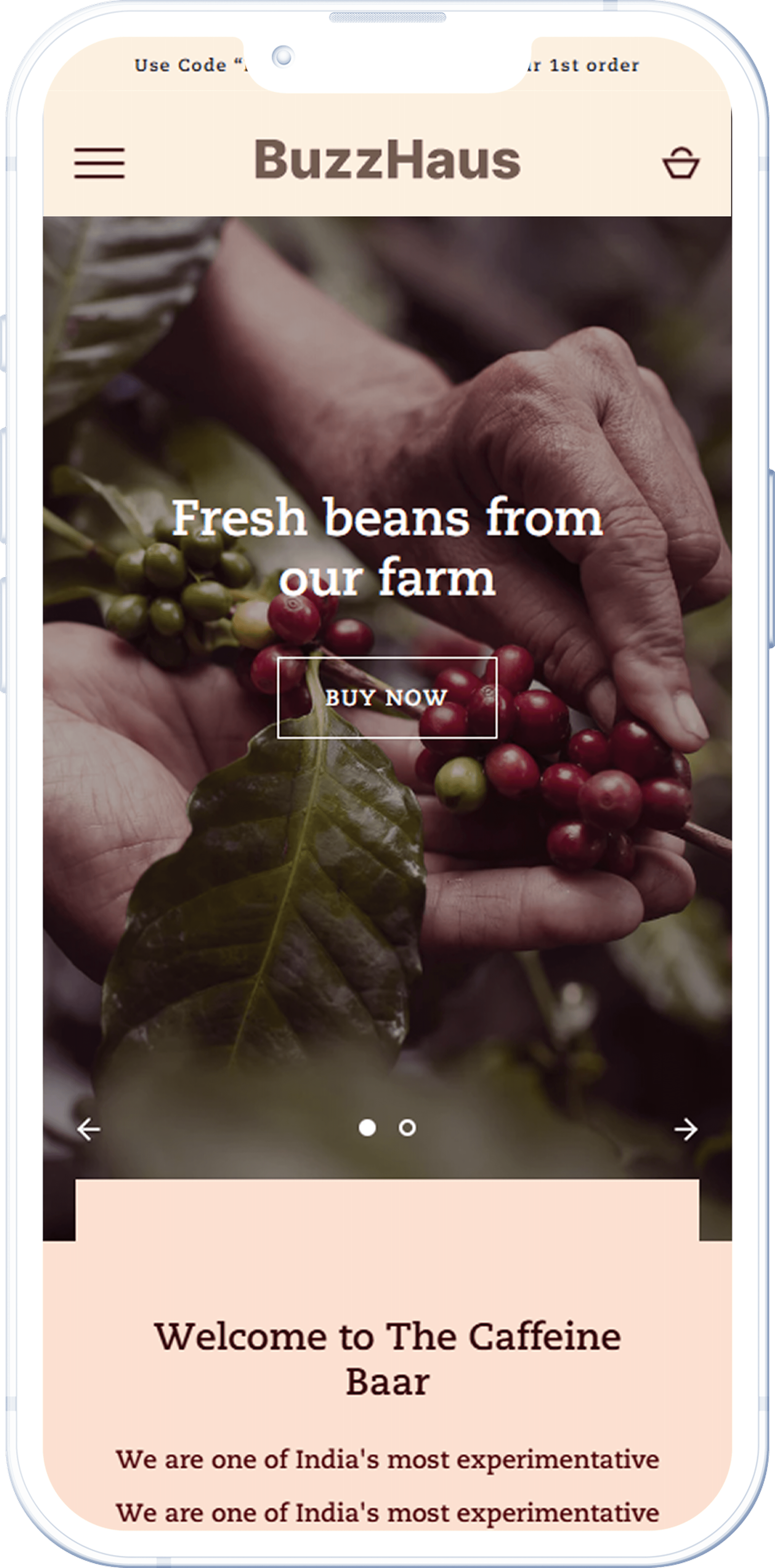
No Clear Direction
WHAT WAS HAPPENING
The homepage was cluttered, making it hard for new visitors to know where to start. Instead of guiding them, it left them feeling lost.
Impact
High bounce rates and lost conversions due to poor first impressions.
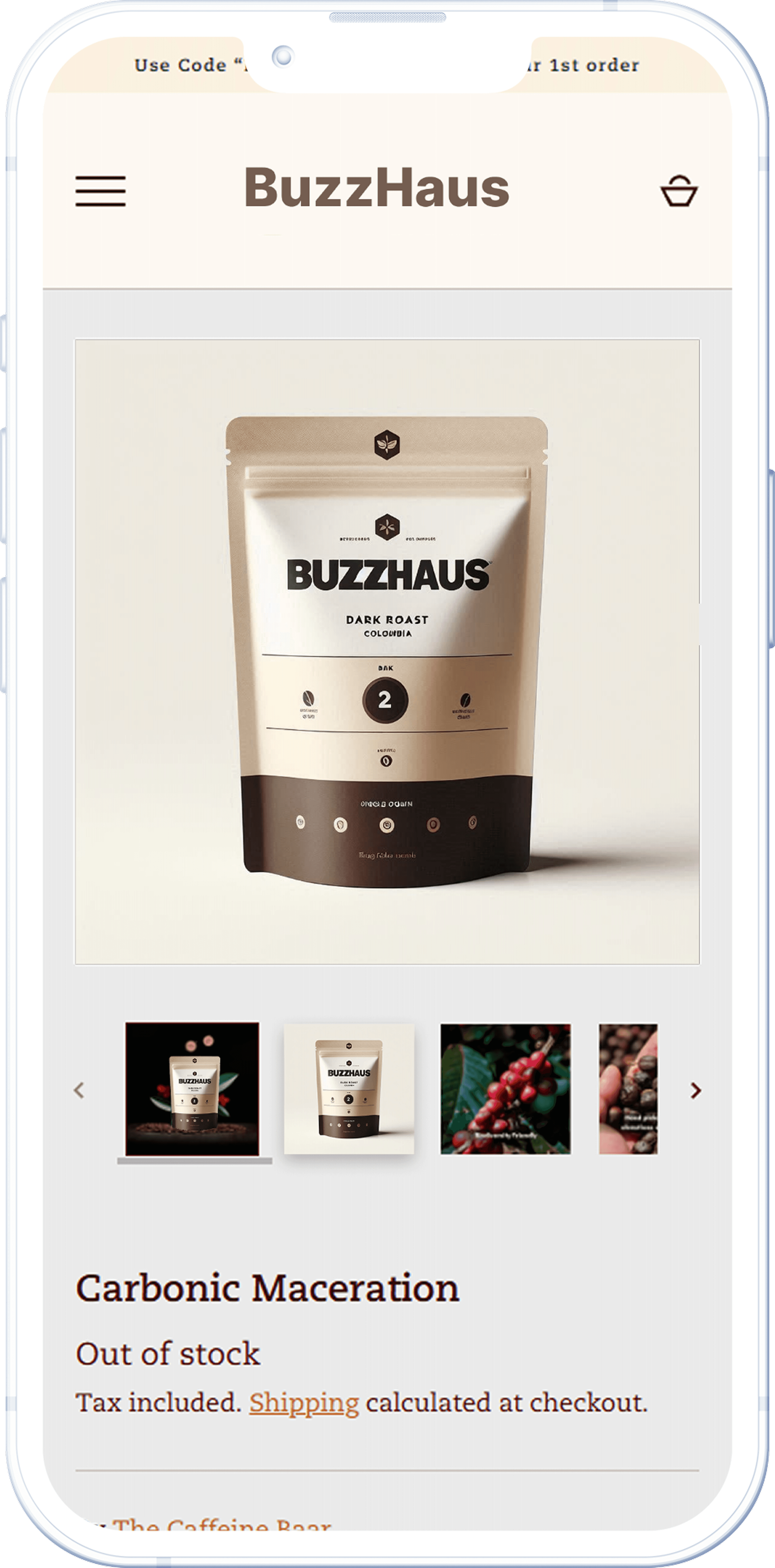
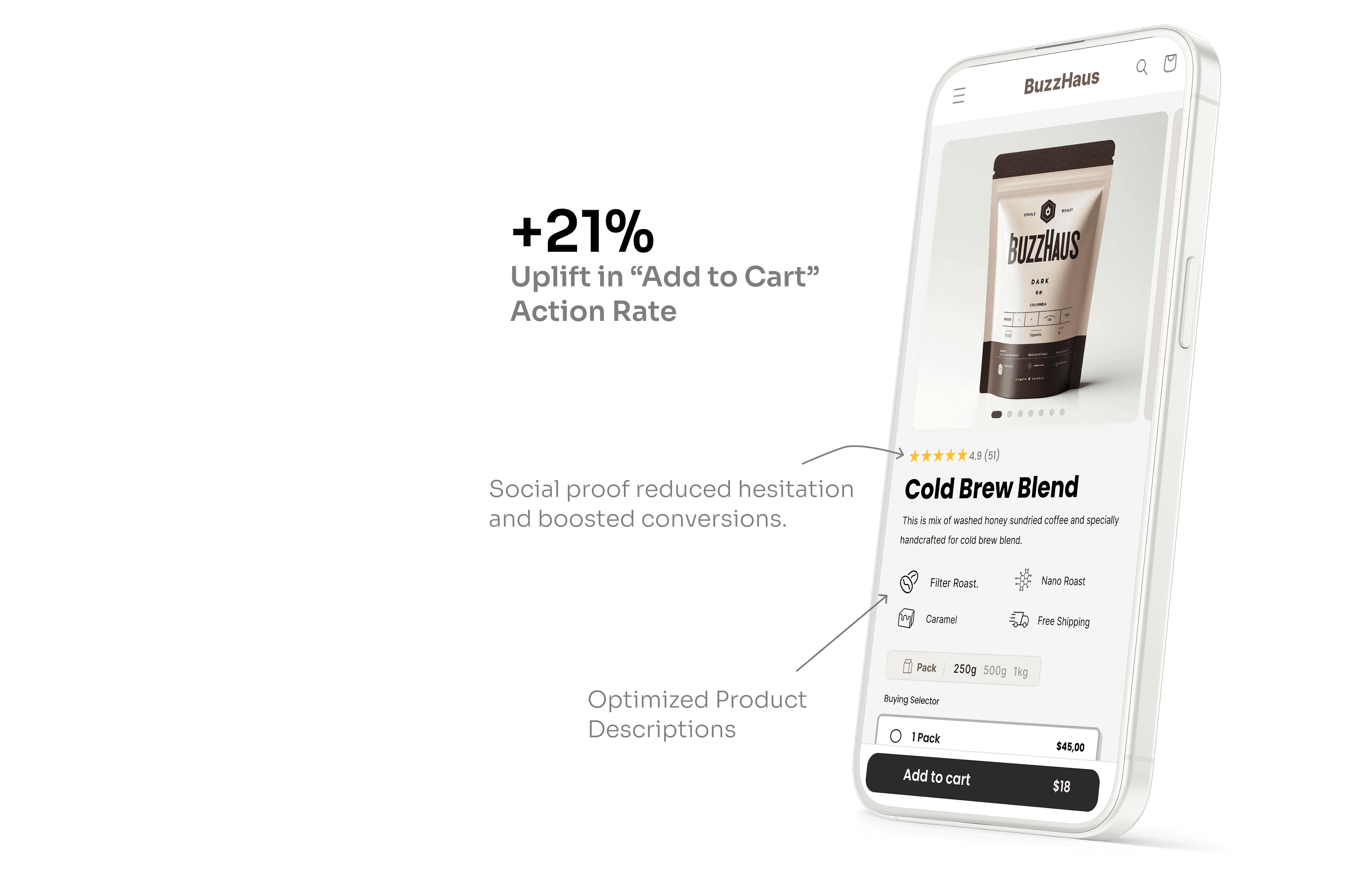
Hard-to-Use Product Pages
WHAT WAS HAPPENING
Key info like size, reviews, and “Add to Cart” were hard to find due to messy layouts. The layout was inconsistent, which made people work too hard to make a simple choice.
Impact
Frustrated users left or delayed decisions, hurting conversions.
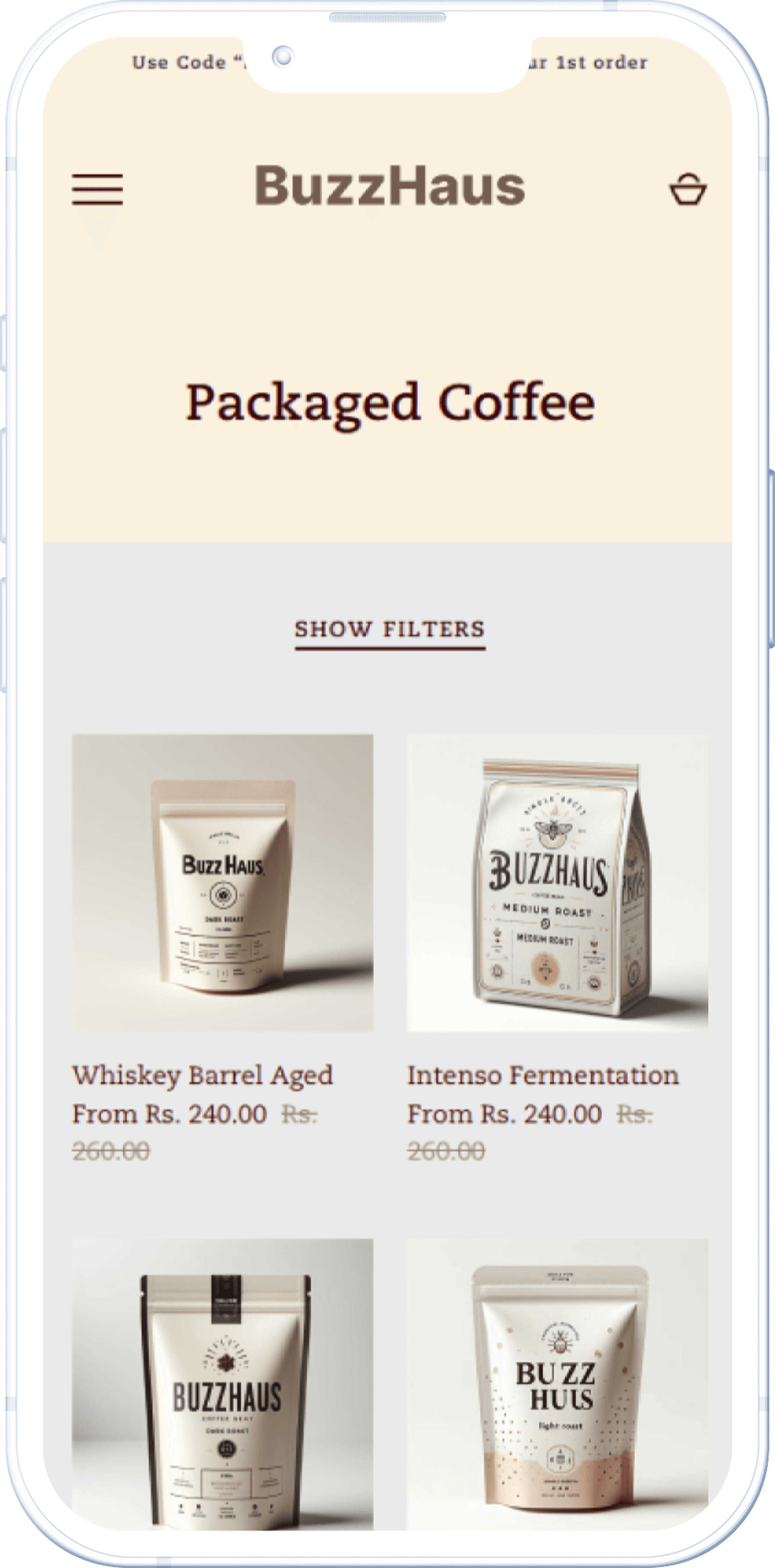
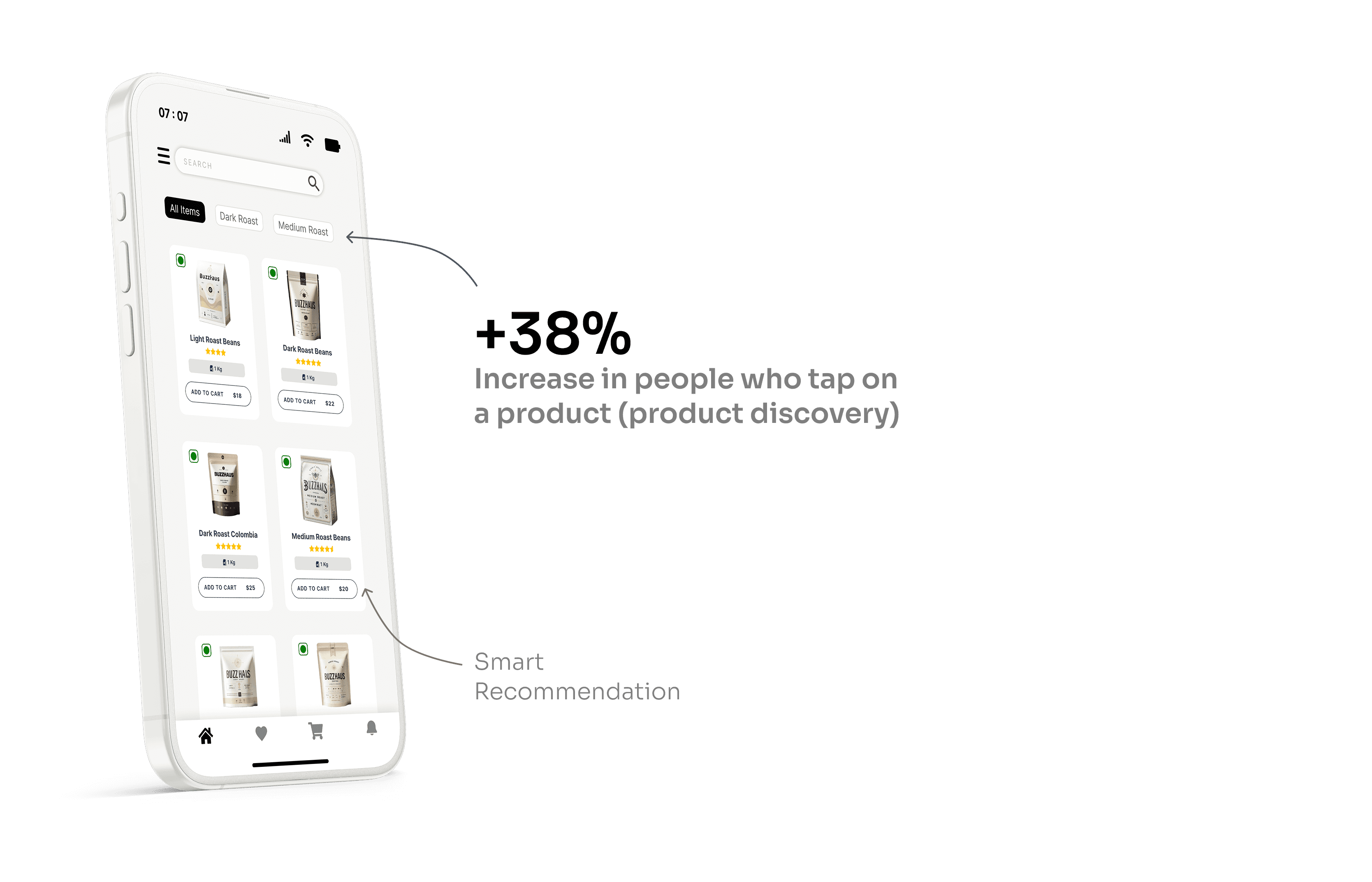
New Users Felt Lost
WHAT WAS HAPPENING
First-time visitors didn’t know which coffee to try. There was no clear direction or guidance, especially for someone not familiar with the brand.
Impact
Without quick clarity or key highlights, new users felt unsure and didn’t buy, hurting first-time conversions.
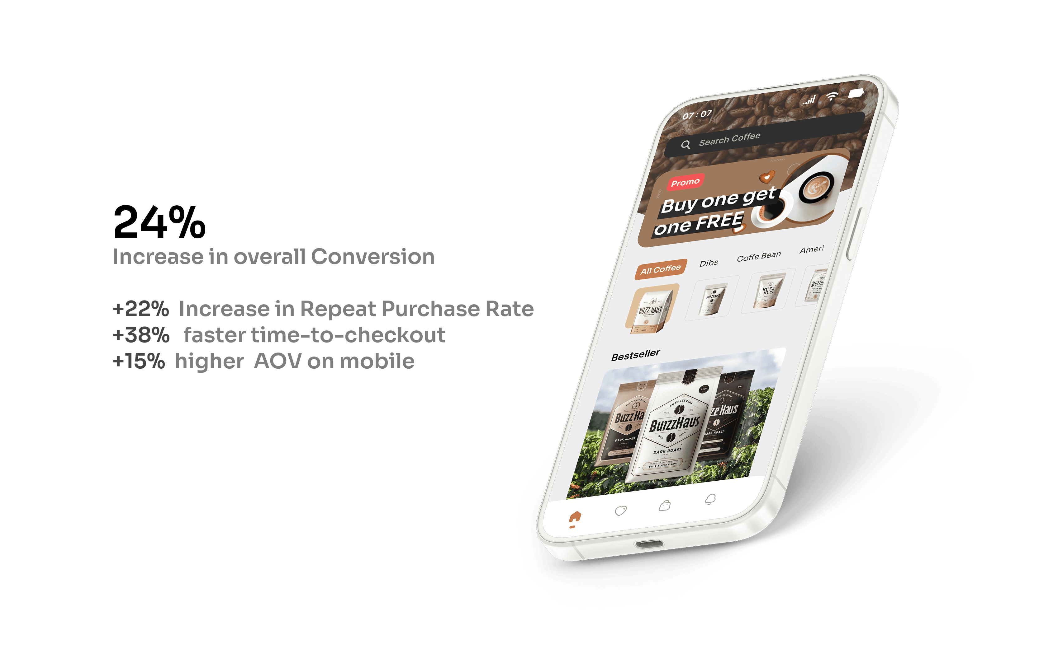
Business Goal
Increase the mobile site’s conversion rate by 20% without changing the product or ad spend.
User Goal
Make it easier for new users to find, understand, and purchase coffee within 2–3 scrolls — with minimal friction and faster decision-making.
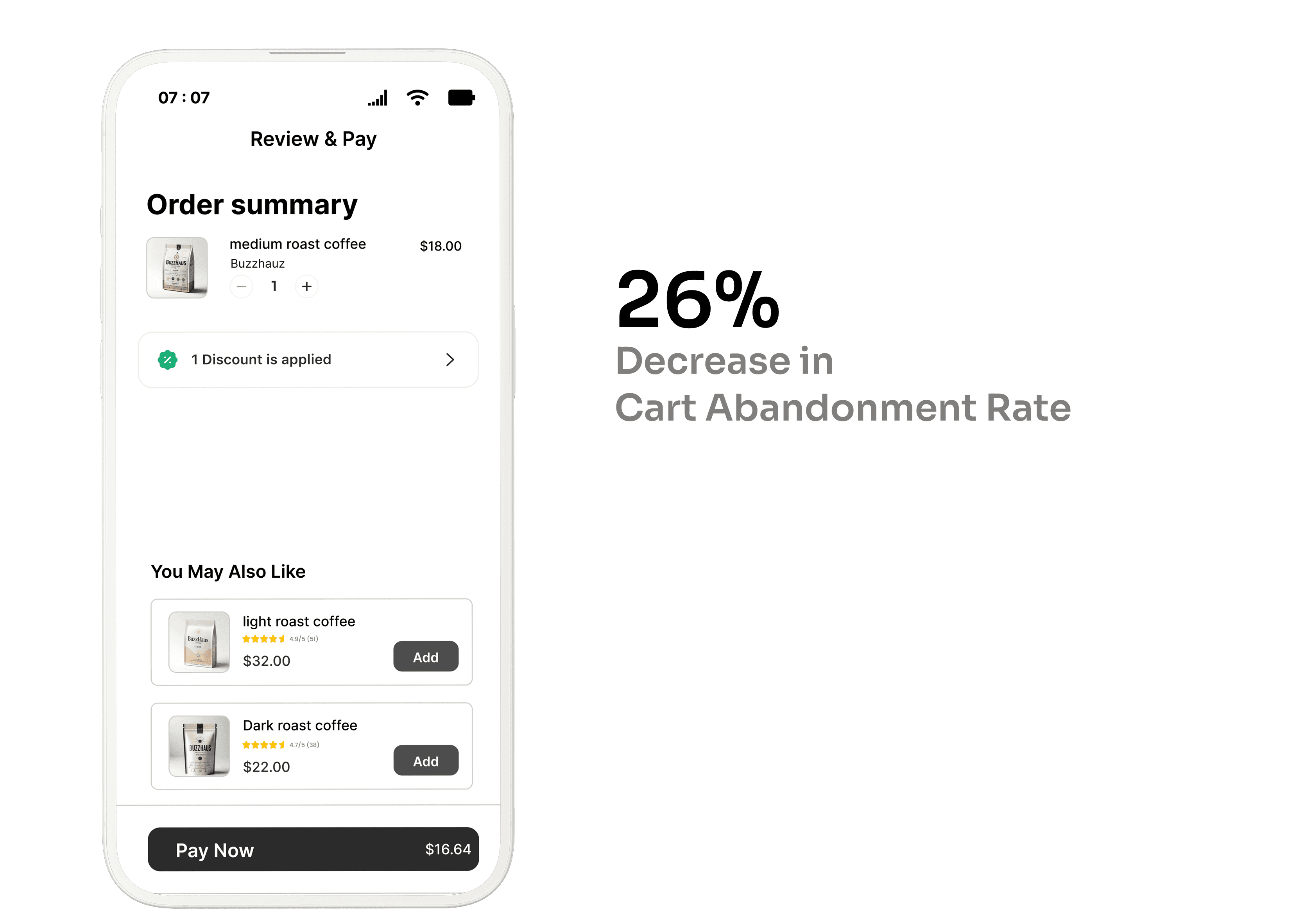
Research
For us at To understand what was going wrong, we used:
Session Recordings to watch user behavior
Surveys to collect direct feedback
Heatmaps to spot ignored sections
Analytics Funnels to trace drop-offs
Insights showed most users were eager to buy, but felt lost or slowed down by the experience. especially first-time visitors..
Next projects.
(2024-25©)